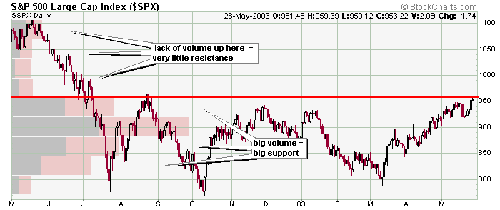
This 13-month SPX chart shows how Price by Volume is displayed. Trader need to pay attention to the locations of large Price by Volume bars because those areas will often act as either support or resistance. This price chart indicates trendline resistance in the 950-965 area and a severe lack of volume above that zone. If the index can breakout, the lack of overhead resistance (indicated by the lack of volume that took place up there) will likely assist a rally because there won't be many traders up there looking to "get out even." Let's see what happened.
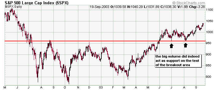
The SPX did break out, and the index quickly rallied to over 1000. Note the massive block of volume below 960 served as support on two successful tests of "resistance turned support."
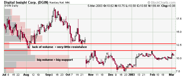
Here is an example using Price by Volume that demonstrates why gaps often get filled. There is very little volume in the gap (and actually there is no volume in the gap for the previous 7 months). The lack of volume translates to lack of resistance. So a move into the gap could shift the supply/demand imbalance to favor the bulls because there are no sellers sitting in the gap wait to "get out even." Let's see how this unfolded.
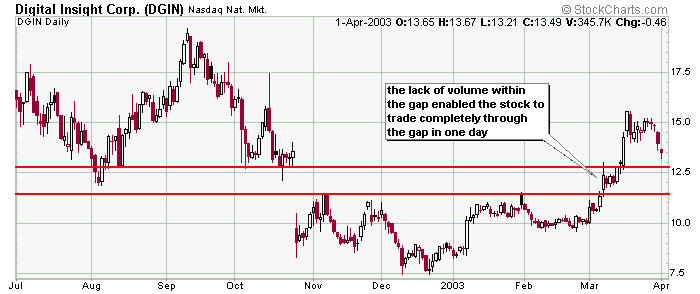
DGIN moved into the gap and filled it in one day. This may be a bad example because the stock rallied big, and you can't expect that to happen often. But it's just an example of how Price by Volume can be used. Plot it on your charts to see where areas of support and resistance my lie.
» back to top
|